Thursday, 7 April 2011

Tuesday, 5 April 2011

Monday, 4 April 2011

Monday, 7 February 2011


Friday, 4 February 2011
Finishing Touches
From finding piczo hard to use due to problems with editing the site, I have moved on to use another webpage maker, called 'moonfruit.com'.
This website has been alot better than piczo because I have been able to make my website the way I want, with pictures and layouts that I wanted as well.
My final decision for my website is that, on the front page, I am having a few main stories, and different local adverts down the left hand side of the page. I have decided to have a black background with white text so that it looks more interesting and eyecatching to the reader. Also, I have designed a few links on the page that contrast with the Hedingham Angel heading, so HA jobs stands for Hedingham Angel Jobs. I thought this would be a good idea because it makes the website look more local as it is local jobs that will be on the page.
My 1st hyperlink page is 'Your Stories' page. This consists of different stoies from the local primary school about what activities/events that have been happening or any news that the school needs to give out to people in the local area.
I have used the same adverts and text on the sides of the page from the home page, so that it makes the website enclosed and suitable for the local people, rather than making different adverts asif it is to be shown to a wider range audience.
My second hyperlink page is 'HA Photos'. This page has pictures of a local primary school's fete, to show the local community raising money for a local charity. I thought this was a good idea because it shows local people coming together and raising money for a special need. On this page, I have also used the same adverts and text on the sides of the page, for the same reason as I had for the 'Your Stories' page.
I am really pleased with my main task, because I have found that from using my research and notes from the start of year 13, it has helped a lot with planning and designing my own website.
This website has been alot better than piczo because I have been able to make my website the way I want, with pictures and layouts that I wanted as well.
My final decision for my website is that, on the front page, I am having a few main stories, and different local adverts down the left hand side of the page. I have decided to have a black background with white text so that it looks more interesting and eyecatching to the reader. Also, I have designed a few links on the page that contrast with the Hedingham Angel heading, so HA jobs stands for Hedingham Angel Jobs. I thought this would be a good idea because it makes the website look more local as it is local jobs that will be on the page.
My 1st hyperlink page is 'Your Stories' page. This consists of different stoies from the local primary school about what activities/events that have been happening or any news that the school needs to give out to people in the local area.
I have used the same adverts and text on the sides of the page from the home page, so that it makes the website enclosed and suitable for the local people, rather than making different adverts asif it is to be shown to a wider range audience.
My second hyperlink page is 'HA Photos'. This page has pictures of a local primary school's fete, to show the local community raising money for a local charity. I thought this was a good idea because it shows local people coming together and raising money for a special need. On this page, I have also used the same adverts and text on the sides of the page, for the same reason as I had for the 'Your Stories' page.
I am really pleased with my main task, because I have found that from using my research and notes from the start of year 13, it has helped a lot with planning and designing my own website.
Monday, 24 January 2011
What I have done so far.
Up to this point i have completed one of the ancillary tasks, which is the newspaper poster. I have also completed the main task which is to complete two pages of a newspaper article.
Within these two tasks, I have been doing research into newspapers which include a Venn diagram, research into the conventions of a newspaper etc. From the research, I have designed and produced my own ideas for the tasks.
The final thing i have to do is the second ancillary task of making a website with two hyperlink pages. I have already started this task but due to having trouble getting Piczo at school (which is the website i am using to make my own website)I am having to do it all at home. However, this isn't a problem because I am able to still use blogger to find all my ideas about what I am putting in my website, but also how I am going to lay it out.
At this moment in time, on my website, i have created the basic things such as the two hyper links, the type of font and font size i am going to use and also where pictures and text are going. The things I am having to do now is put the information in the website such as stories and other little bits such as advertisements.
The only thing i am struggling with at the moment, is uploading the pictures i am needing. However, this should soon be overcome because i am going to talk with the technicians about how to fix the problem.
Within these two tasks, I have been doing research into newspapers which include a Venn diagram, research into the conventions of a newspaper etc. From the research, I have designed and produced my own ideas for the tasks.
The final thing i have to do is the second ancillary task of making a website with two hyperlink pages. I have already started this task but due to having trouble getting Piczo at school (which is the website i am using to make my own website)I am having to do it all at home. However, this isn't a problem because I am able to still use blogger to find all my ideas about what I am putting in my website, but also how I am going to lay it out.
At this moment in time, on my website, i have created the basic things such as the two hyper links, the type of font and font size i am going to use and also where pictures and text are going. The things I am having to do now is put the information in the website such as stories and other little bits such as advertisements.
The only thing i am struggling with at the moment, is uploading the pictures i am needing. However, this should soon be overcome because i am going to talk with the technicians about how to fix the problem.
Tuesday, 18 January 2011
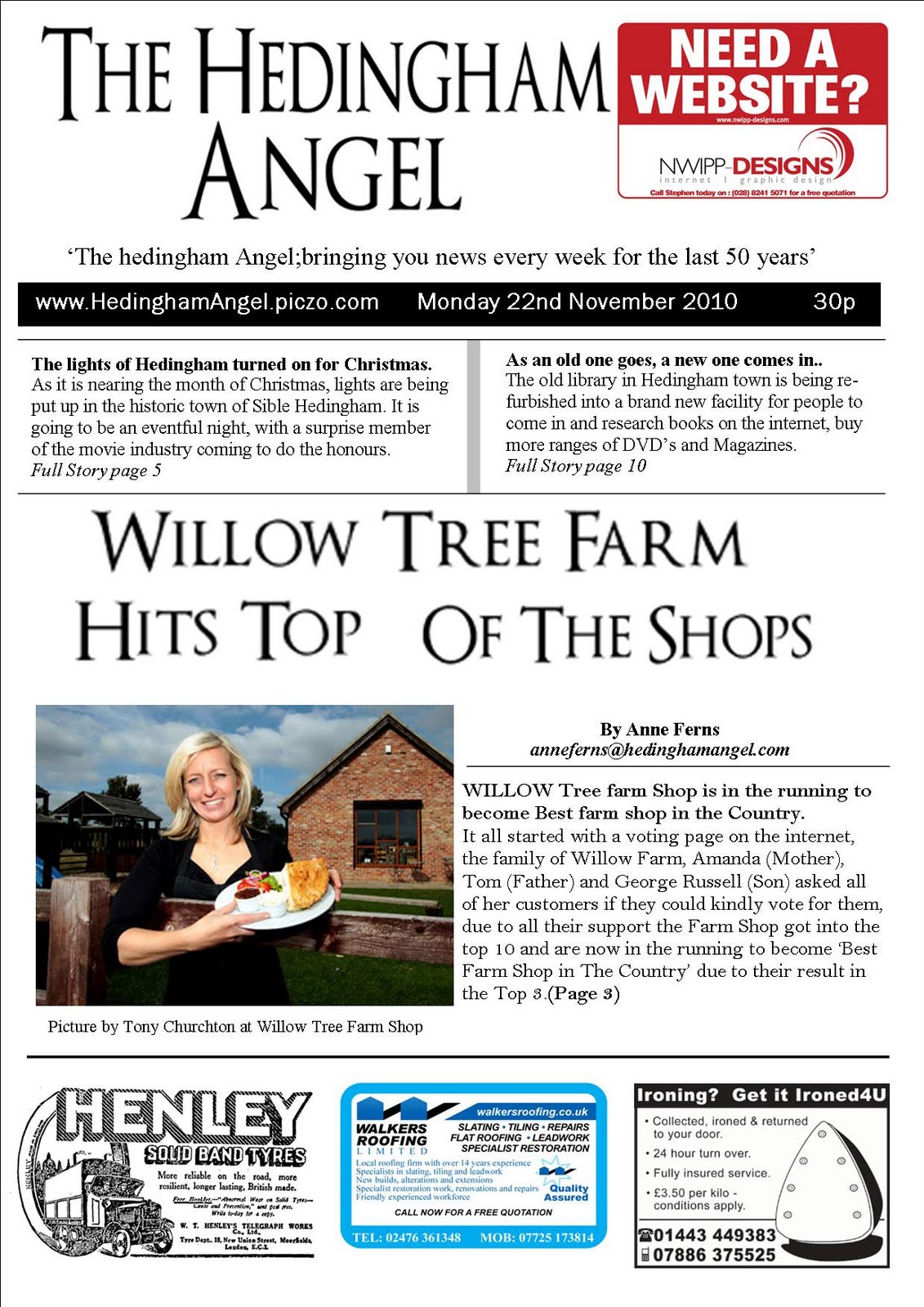

This is my finished main task of completing 2 pages of a newspaper; front cover and a second page. I have gained all my ideas for the layout from different newspapers that I have looked at that are shown on my blog. I have enjoyed doing this task because I was able to design the layout out myself and make it on my own.
Also, by doing this, i was able to work independantly and have no fuss about different ideas that other people have chosen when being in a group.
Monday, 17 January 2011
Changes
During this last month I have been changing and making a second page for my newspaper, I have chosen to do the sports page.
When finding out information, I have been looking on the Internet, looking at the layout of how other newspapers set their sports page.
Due to the page being about football, I have also made up a league table to make the page look more realistic and professional.
However, I have had to change things on my first page because there is too big a space at the top, so i have made a slogan, so that i can push the main heading up to make less space.
Once I have finished the two pages for the newspaper, I will go back to doing the second ancillary task. When I started to make the website on piczo, the computers weren't letting me edit the page at school, this is due to it saying the web page was blocked, however I was told it was unblocked, therefore I postponed this task until I have finished the main task of the two newspaper pages so that I have enough time to finish it at home.
When finding out information, I have been looking on the Internet, looking at the layout of how other newspapers set their sports page.
Due to the page being about football, I have also made up a league table to make the page look more realistic and professional.
However, I have had to change things on my first page because there is too big a space at the top, so i have made a slogan, so that i can push the main heading up to make less space.
Once I have finished the two pages for the newspaper, I will go back to doing the second ancillary task. When I started to make the website on piczo, the computers weren't letting me edit the page at school, this is due to it saying the web page was blocked, however I was told it was unblocked, therefore I postponed this task until I have finished the main task of the two newspaper pages so that I have enough time to finish it at home.
Thursday, 9 December 2010
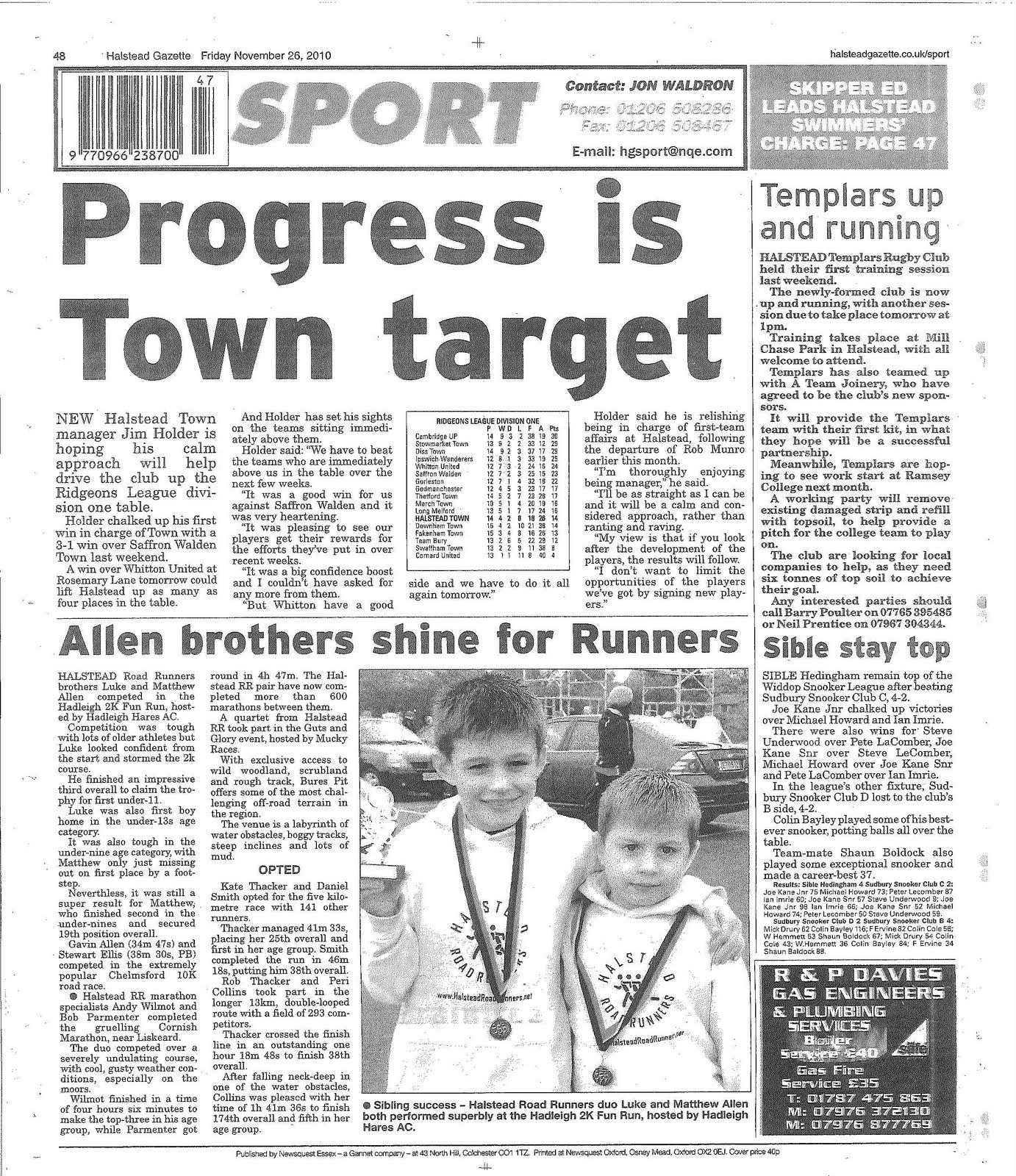
I started my second page of the newspaper by looking through local newspapers to see what sorts of pages there are, and this is an example of what I have found.
This page is a sports page from the Halstead Gazette, and i am going to use this category as my second page, this is because it is a page that most people are interested in because it shows achievements in sports from people in the area. For example, in the picture, there are two brothers that took part in a Road Runners day, and won a medal.
Also, one of the main stories is that Halstead are moving up on the table, this could be a great stpry to use, as it shows how the town is making more achievements and getting better at what they take part in.
I am now starting to plan my second page, and the layout on the picture is one that i am going to use as a template because it is a good way to put in a few more stories rather than one main story.
Monday, 6 December 2010
Final Front Page

This is my finished front page. I have used information from what i found in my questionnaire that I did, for example the main colour that was answered was black.
I have also used different layouts from thw newspapers that I annotated to make it look like a Local newspaper.
Now that I have completed this, I am going to move on to the second page, because piczo still isnt working and it will take up the time that i waste waiting for piczo to work.
Trouble
I have been having trouble doing my website, due to the internet blocking piczo, but also, because I havent had the internet at home. Thefore I have started 2 pages of a newspaper so that i am doing something, and keep having to wait for piczo to work. Over the past week, I have been working on the front page, and I have just finished it.
Because I had researched newspapers earlier in the year, I was able to look through what i had done, plan the front cover and then actually do it.
This researched included:
- Questionnaires
- Annotations of newspapers
- Comparing Local newspapers
- Conventions of local newspapers
- Venns diagram
From all this researched I was able to include different adverts and where to out them, what colours to use from my questionnaire that I made, what layout to use, and what the front headline should be about.
Because I had researched newspapers earlier in the year, I was able to look through what i had done, plan the front cover and then actually do it.
This researched included:
- Questionnaires
- Annotations of newspapers
- Comparing Local newspapers
- Conventions of local newspapers
- Venns diagram
From all this researched I was able to include different adverts and where to out them, what colours to use from my questionnaire that I made, what layout to use, and what the front headline should be about.
Monday, 8 November 2010

Because i am having to include 2 hyperlinks on my webpage, i am looking at the sports section of the Subury mercury to see how they have layed things out and how sections are presented.
Firstly, the page is set out with different sub-headings, for example, rugby, cycling and also the Colchester United Football club. This helps the reader because its easier for them to navigate around the page.
Also, under each sub-heading there are small sentences to show the reader what the hyper link is about, for example,'Town isnt having two upront' this hyperlinked sentence leads on to a page explaining why Ipswich Town didnt have two people upfront.
From these two examples from the web page, i have thought of a few ideas of what i am going to include on my website, for example, i am going to use the idea of having different sub-headings on the sports page, to seperate out all the information.
Friday, 5 November 2010
Research on the Sudbury Mercury

I have researched the Sudbury Mercury due to it being another popular local newspaper and webpage.
Firstly, news feed of the main stories in the Mercury are typed continuously at the top of the page. This catches the readers attention as its the only thing that moves on the website.
Another thing that catches the readers attention is the big black masthead of the Sudbury Mercury at the top left hand side of the web page. Similar to the Halstead Gazette are the colours that are used. Black and red are used in the Sudbury Mercury, this maybe to get the effect that the Halstead Gazette has of connotations of urgency and important, however, the Sudbury Mercury has the colours on the different catagories, not just on the mast head. This may be to make the page look more serious and important.
On the other hand, The main story has a big picture in the top middle of the site, which gets the readers attention and it makes clear to the readers what is going on in their local area.
All the different catagories are positioned at the top of the page under the masthead. The main thing that makes the catagories eye catching is the black background, this is because black is a very outstanding colour. Also, when someone hovers the mouse over a certain catagorie it turns the background to red, to show what the reader is about to click on, this is clever because it makes the website more interesting.
Finally, There are all different advertisements at the left side of the page, this is different because its something that people can use for themseleves, wether they want to find a new job or a new home.
Tuesday, 2 November 2010
Research on the Halstead Gazette website

On the Halstead Gazette website,I have found 5 different things that i can identify that are things that i am looking for and I can use on my newspaper website.
Firstly, The Masthead is put in a good place because its the first thing that draws the reader’s attention as it stands out as it is big and bold. Also, the colours that have been used for the Masthead also have their own connotations. For example, black is a connotation of seriousness and importance, and similarly, red is a connotation of urgency. Both of these colour represent that the website and newspaper are essential for people to read.
Similarly, the date is displayed at the top of the page, which shows the reader that it is up to date and will have new and recent news and information for people to read.
Also, at the top of the page there is a little point that tells people to send in their pictures, videos and news. This makes the website more local due to people from the local area being able to put their own information for people to see or read.
On the other hand, below the Masthead, there is all the different catagories for the website, however, this is a good place for them to be, as the first thing that people see is the masthead. There isnt too many catagories for people to go through, but this may be a good thing because the different catagories lead to the main points that people want to know, for example, 'sport' and 'local info'.
Finally, the main story of the halstead Gazette is Matt Cardle in the X-Factor, this is made clear by the main picture placed in the centre at the top of the page. This also makes it clear to people that he is a local guy and that people in the local village are supporting him and want him to do well.
Friday, 8 October 2010
Next step.
Now that I have completed my first ancillary text, I am going to start my second one, which is to make a homepage and two hyperlinked pages for the newspaper website.
Before I start making my website I am going to research some local newspaper websites to see what they include, so I can get an idea of what I am going to include. Things that I am looking for in the research are: what kinds of stories they feature, how they present their stories, e.g. what type of font they use, how big the font is, what colours the website has.
I am also going to look for what catagories are used on the websites, and from this I can refer back to my questionnaire to see if the results are similar to different local newspaper websites.
Before I start making my website I am going to research some local newspaper websites to see what they include, so I can get an idea of what I am going to include. Things that I am looking for in the research are: what kinds of stories they feature, how they present their stories, e.g. what type of font they use, how big the font is, what colours the website has.
I am also going to look for what catagories are used on the websites, and from this I can refer back to my questionnaire to see if the results are similar to different local newspaper websites.
Monday, 4 October 2010
My Final Newspaper Poster

This is my final Newpaper poster that i have completed.
I have used Microsoft word to produce it, I have also used 'dafont' on the internet to find the right text to use for the writing.
Similarly, whilst looking up different newspaper posters, i have used the idea of having a header and footer to make it look more effective.
Newspaper posters grab the readers attention by being bold and simple, so i have used these ideas within my poster by having the font size quite big for the masthead and a smaller but still quite a large font for the catchy headline.
Monday, 20 September 2010
Research into Newspaper Posters
 I have been looking around on google to find some images on what newspaper posters look like. I have found one that I am going to use as a template for my newspaper poster.
 This poster is a great example for a local poster as it has an advantage of being very simple which makes it stand so people who walk past will see the poster, and if they are interested in reading about a local event they will want to read more.
Questionnaire follow on..
following on from my first questionnaire with students, i have done the same questionnaire but to adults. i have chosen adults to answer my questionnaire this time because i might give me another variety of answers, and this means i can also compare the two questionnaires.
I found that nearly all of the people that answered my questionnaire expected 19-45 year olds to read newspapers, but also most of their second choice was 46-90 year olds.
10/12 adults said that they read local newspapers. The two most popular are The Sun and The Halstead Gazette. This may be due to The Sun being less detailed and less time consuming, and The Halstead Gazette being easier to read, but also its local, so they will be interested to read about whats been happening in their local area.
On the other hand, 2/12 said they didn't read newspapers, and the reasons for this are: They are boring and too depressing to read.
Finally, the most popular name for a local newspaper in the adult questionnaire is 'The Hedingham Angel'
Due to 'Hedingham Angel' having more popularity than the 'Yeldham Moon' form the other questionnaire, it is my final choice of the name for my local newspaper.
I found that nearly all of the people that answered my questionnaire expected 19-45 year olds to read newspapers, but also most of their second choice was 46-90 year olds.
10/12 adults said that they read local newspapers. The two most popular are The Sun and The Halstead Gazette. This may be due to The Sun being less detailed and less time consuming, and The Halstead Gazette being easier to read, but also its local, so they will be interested to read about whats been happening in their local area.
On the other hand, 2/12 said they didn't read newspapers, and the reasons for this are: They are boring and too depressing to read.
Finally, the most popular name for a local newspaper in the adult questionnaire is 'The Hedingham Angel'
Due to 'Hedingham Angel' having more popularity than the 'Yeldham Moon' form the other questionnaire, it is my final choice of the name for my local newspaper.
Tuesday, 14 September 2010
Starting the poster.
In todays lesson, I have looked into different farm shop pictures and used them for my poster. this is so that when the local community see the poster, they can recognise who the story is about. I then picked out parts from the draft of my main story, to have a local heading for my poster. Hopefully the heading that I have chosen will interest the people who pass by as it quite catchy and people may want to know more about the story, so they buy the newspaper.
However, I am still working on my newspaper poster, as i need to use the graphs i have for the quesitonnaires to identify which name i use for my local newspaper.
However, I am still working on my newspaper poster, as i need to use the graphs i have for the quesitonnaires to identify which name i use for my local newspaper.
Subscribe to:
Posts (Atom)